How the factory works
Short answer
- Importance
- Availability
- Resourcing
Long answer
Many of you ask us how we decide which facts to share each week, so here is the full process:
1. Issues research
The issues that Kiwis care about the most are always our starting points, and this is fairly easy to find… if you know where to look.
Several leading research companies publicly share their issues polling:
- IPSOS
- Curia
- Kantar
- Essential, a new player, has just started releasing issue rankings too, although it looks like their list is limited and the outcomes could be influenced by the wording choice.
- Closer to general elections, other researchers will also ask and share these insights.
Each research business uses different methodologies, terminology, and pre-defined issue lists, but there are consistent issue trends between them all.
We put the greatest weighting on IPSOS results because they:
- Publicly share the full issues list that they test.
Curia and Kantar don’t. We are not sure what Essential tests, but have asked Essential for more information and will reference them further once we learn more. - Have a (fairly) robust issues list.
Since the others don’t share their full lists, we can’t confirm how robust their lists are or not. We used the term ‘fairly’ above because, like most others, they don’t test ‘Social unity/division’ and they only have ‘Healthcare/hospitals’, not ‘Mental health’ as a separate issue like some of the others. - Ask all respondents about all issues.
Curia does too. Kantar shows respondents 20 ‘concerns’ at random from a list of 48 in total. We don’t know what Essential does yet. - Publicly share their full results.
Kantar shares only the top 10 issues overall (out of the 48 they test), plus some other insight snippets for certain voter segments. Curia shares some results, in some months, e.g. nothing in July, just 3 issues in June. Again, we don’t know enough about Essential, yet, until we hear back from them. - Their data is current, having been tested in May 2023, and released in June.
Curia and Essential are even more current with monthly results, but Curia’s results are not always publicly shared. Kantar’s latest report was researched in February-March, so is still fairly relevant too. - Ask for a top 3 (we’re not fans of writing numbers as words FYI).
Essential asks for an importance score which is even more superior as it gauges both relativity to other issues, and also importance changes over time. Curia asks for a top 1 only, which skews the result weighting towards the major issue(s) that are top of mind, e.g. cost of living. We are not sure how Kantar generates their % scores, but we have asked. - Use generic language, not leading language which can skew results.
Curia uses generic terminology, too. Kantar has ‘Protection of NZ Children’ in 2nd place, but that is emotive language and covers many areas, e.g. education, health, crime, and poverty/inequality, so it is hard to interpret this result. Essential uses ‘Home ownership for all New Zealanders’ rather than ‘Housing/housing affordability’ which will also produce a different result because of the way it is asked, e.g. you may support affordable housing, but not believe that everyone should own a house. - For more information on the differences, see https://thefacts.nz/social/inflation-cost-of-living-is-the-1-issue-for-kiwis/.
- A key point to make here is that none of the research companies show the importance of issues over time, and we feel this is a major insight gap for New Zealand:
- IPSOS and Curia ask for a comparative ranking only, so an issue could be going down the ranked list even though the public is more concerned about it, or, in reverse, an issue could be shown to rise up the list, even though the public is less concerned about it.
- Kanter asks for a level of concern but doesn’t show the trends over time for the top issues, and only does this research once per year. It’s also harder to interpret their work for all of the limitations mentioned earlier.
- Essential asks for a level of concern but has only just begun so there is no time series data, yet. There are also limitations around their work as mentioned earlier.
INFLATION/cost of living is still easily the #1 issue in the minds of Kiwi voters according to IPSOS, Curia, Kantar, and Essential, and a long way ahead of other issues.
The next 3 issues, when writing this page in August 2023 and looking across all research, are fairly consistent:
- CRIME/law & order
- HOUSING/price of housing
- HEALTHCARE/hospitals
Other issues often in the top 10 include:
- The 3 Es:
- ENVIRONMENT/climate change
- ECONOMY (a broader economic measure beyond just inflation and housing)
- EDUCATION
- And 3 deep social issues:
- POVERTY/inequality
- FAMILY VIOLENCE
- MENTAL HEALTH
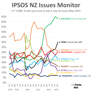
SOCIAL UNITY/division is rarely measured, so we’re not sure yet where that sits on the priority list, but some research companies are starting to include it within individual polling questions since anecdotal evidence suggests that it is of significant concern to many New Zealanders. We’d like to see all research companies include ‘Social unity/division’ as a standard issue option going forward.
GOVERNMENT PERFORMANCE is measured separately since it covers how well we think our government is managing all of these KPIs listed above, and there are 2 key metrics that measure this:
- Right/wrong direction scores for our country.
- Political polling.
This collective issues research is also how we’ve formed the categories at the top of our homepage:
- Economy is a big category, so we’ve also added Business (employers) and Jobs (employees) to split this out
- Infrastructure is not well tested but is spoken about often, especially with the policies around Three Waters, Roading, and RMA reform, so we’ve included it.
- Sport is not an issue, but we’re a) Kiwis and b) need to break up the serious and negative facts sometimes!
We will continue to monitor all issues research and adjust the facts we produce as a result. If you feel we haven’t placed enough emphasis on a particular issue area, then please let us know!
2. Issue topicality
While the researched and ranked broad issues listed above change slowly over time, many specific issues can spike in interest and importance quickly, and, just as easily, fade from public consciousness again.
These are usually caused by:
- Media coverage, e.g. the Posie Parker protest was very divisive and gained a lot of headlines, so we shared a fact that showed how tolerant New Zealanders are as a whole towards the transgender community.
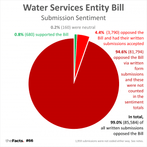
- Political scandal, e.g. the Minister of Local Government at the time, Nanaia Mahuta, said that Three Waters would be opt-in for councils before making it mandatory. 99% of submissions (85,584) then opposed the Water Services Entity Bill, but 81,794 of them were combined into one ‘form submission’ and this significant 99% opposition to the bill was ignored in the democratic process.
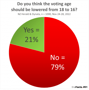
- Political policy, e.g. the Labour Party signaled a desire to reduce the voting age to 16, so we shared an NZ Herald Dynata poll that showed 79% of voters don’t want the voting age lowered.
- Data releases, e.g. after financial reports from Treasury, we will often share a CPI inflation or GDP statistic.
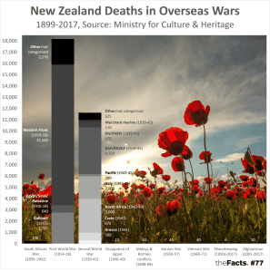
- Key dates, e.g. on ANZAC Day, we shared data on New Zealand deaths in overseas wars.
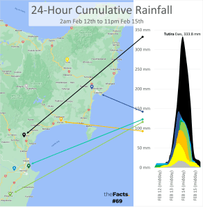
- Weather events, e.g. the Auckland and Hawkes Bay floods.
![]()
- Mis/dis/malinformation, especially when prominent Ministers mislead the nation,
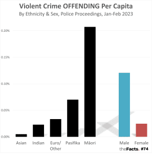
- Sometimes, this is headline news, e.g. when Green’s Co-leader Marama Davidson said “I know who causes violence in the world – it is white cis men.” we decided to look into NZ’s violent crime statistics by ethnicity and found that, actually, here in New Zealand, Māori females cause more violent crime per capita than European/Other males.
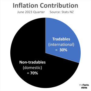
- Sometimes, this is headline news but the misinformation is missed, e.g. when the Finance Minister, Grant Robertson, kept blaming foreign factors for our high debt, we worked out that >70% of NZ’s inflation is caused by non-tradable (primarily domestic) inflation.
- And sometimes these comments get missed by the media entirely, e.g. when the Prime Minister himself, Chris Hipkins, misled the nation that the economy has grown faster under the current Labour-led Government than the previous National-led Government.
3. Issue vacuums
Following on from that last point, sometimes, no politician or media outlet seems to be talking about the important issues are all. For this, we use our intuition and myth-busting skills, e.g.
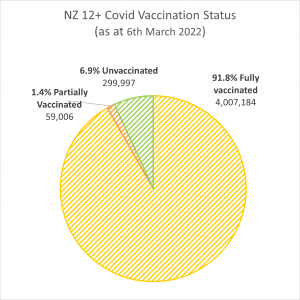
- It didn’t feel like 96% of the country had received Covid vaccinations, so we went looking for the data and discovered that the Ministry of Health had been misleading us by counting only their database, and not the whole country.
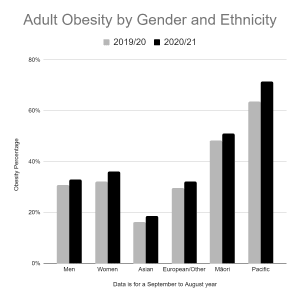
- We also suspected obesity was going up as a result of lockdowns (and our own waistlines!), so went looking for that data too which proved our hypothesis to be true.
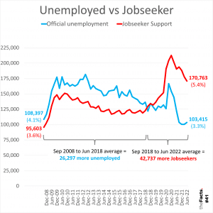
- We are often told the Official Unemployment Rate is low, but somehow, the number of Kiwis on Jobseeker Benefits rapidly overtook the number officially unemployed and then exceeded it by a margin of 67,000 more. We still haven’t got to the bottom of this one.
4. KPIs
After agreeing on the issues, the next step is to work out the best KPI/metric/statistic to determine how each is going. We use a raft of methods to determine this:
- Government targets, e.g. ED wait times and childhood immunisations are 2 key performance indicators for the Ministry of Health, and were under the previous National-led Government too. We also ask government departments for their expertise on what the best measure is for each issue.
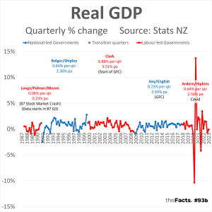
- Convention, e.g. (Real) GDP % change per quarter and annually is the most common measurement of economic growth or decline.
- Common sense (not always so common), e.g. while most others lead with GDP, we know that GDP Per Capita is a more accurate measure of how well an economy is performing relative to its growing population, the impact on individual households, and productivity.
- Thought leaders, e.g. Alwyn Poole from InnovativeEducation.co.nz speaks passionately about curriculums, teachers, and qualifications, but tells us that none of that matters if we can’t get children to school in the first place, which is why attendance/truancy is an important early metric to look at for education.
And, sometimes, the KPI needed just isn’t available. Usually, this is because it’s not measured by government departments. In these situations, we always encourage those organisations to start tracking these metrics.
5. The 5 I’s/Ayes test
Once we have our issue and KPI, we then test it against the 5 I’s below:
- Important = Is it a BIG issue/debate, or is someone proposing a BIG solution, and do we have a BIG insight to add value to the conversation?
- Irrefutable = Do we have robust, accurate data from a reputable source, that is very difficult to challenge? It can take weeks or months to get a fact to this point, if at all.
- Intuitive = Can most readers grasp the insight within 3 seconds? If not, then we also lose much of the audience. We’re very conscious that we live in a soundbite world, so try to deliver bite-sized information. This is why we break complex issues down into smaller, digestible pieces. This isn’t always possible, e.g. more difficult economic concepts/metrics like tradable vs non-tradable inflation. We don’t always get the simplicity right, either, but we are always learning how to better share complex important insights on complex important issues to improve comprehension. Some of our greatest successes to date have been memory hooks that are very easy for others to remember and recite, e.g.
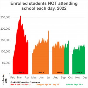
- 100,000 kids don’t go to school each day
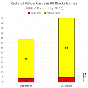
- The All Blacks get 50% more yellow cards than their opposition
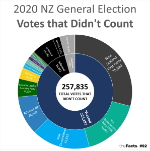
- 1/4 million votes didn’t count last election
- Interesting = Do Kiwis care? No matter how important an issue is, how irrefutable the data is, or how intuitive it is to interpret, if no/low one engages with our work, then we’ve failed to create mass engagement and, therefore, likely also failed to create significant positive change. As such, we try to pair powerful insights with the smartest and sexiest visual techniques to increase engagement.
- Impartial = Do we have sufficient data so that we can present a fair and balanced picture? It’s very important we present just the facts, not political bias or manipulation of any data to suit a particular narrative. The greatest challenge we get from readers is with regard to the number of years shown, but this is usually outside of our control and dictated by government agencies and what they make publicly available.
6. Other fact decision considerations:
- Timeliness – great facts are current facts, so we try to avoid anything that’s beyond its best before data. Generally, this means we use data that was current within the last 3-6 months (for quarterly or annual releases). Sometimes, though, e.g. Census data or death data, you have to wait 2 years or more to get the results.
- Exclusivity, e.g. if we’re sharing facts you can’t get anywhere else, then that helps grow engagement too, e.g. it felt like the All Blacks were getting a lot of yellow cards, so we did the analysis and then broke the story that the All Blacks got 50% more yellow cards than their opposition in 2022. Other exclusive data sometimes comes from OIA requests, or commissioned reports we pay for.
- Variety. We try to cover facts over a wide range of topics, and our issue categories helps us keep track of this:
Business | Crime | Economy | Education | Equality | Environment | Government | Health | Housing | Infrastructure | Jobs | Social | Sport | Other - Virality, e.g. we knew that discovering ‘2/3 of journalists are left-wing’ would go well, especially with that headline, and this helps not only that fact but also awareness for all the other 90+ facts we’ve done too.
- Awareness, e.g. political polls already get great media coverage, so they don’t become facts for us. Conversely, there are many important metrics that impact New Zealand that are rarely known, e.g. net births (births minus deaths) are ~25,000 every year, so our population is always growing regardless of net migration.
- Positivity/negativity – we are very conscious that most Kiwi KPIs have been heading in the wrong direction in recent years, and by confronting these, we can be perceived by some as negative, or anti-Government. As such, we try to balance this with positive facts whenever we can get our hands on them. Unfortunately, this has proven very challenging. We even asked all 120 MPs for positive KPIs for NZ, and only one replied with any (thanks, Hon Eugenie Sage!).
7. Data gathering
The hierarchy for seeking information is as follows.
- Publicly available information. We always try to find the data ourselves first, and ask for permission if this is from a private sector organisation.
- Information request. If we can’t find what we’re looking for, we ask the relevant Government ministry/department.
- Official Information Act (OIA) request. If that information is still not available, or withheld, then we put in a formal OIA request. We always try to request as many years of data as is available.
8. Data processing and visualisations
We started off using Google Sheets for ease of collaboration but found the functionality too limiting, so we have returned to Microsoft Excel and pushed it to its limits. In the future, as resources allow, we’d love to create even more beautiful and interactive graphics. For now, though, Excel has served us well.
9. Supporting content
In addition to the graph(s), each fact detail page also lists:
- A headline (for engagement) and a graph title (statistical description)
- Key insights
- Key questions to spark/foster discussion
- Social media buttons to have your say
- Data notes (including any disclaimers)
- Data sources (something that, frustratingly, many politicians and social media posters fail to do)
- Credits (including a thank you in every email)
10. Limitations
theFacts does what it says on the tin – we present facts. We will also ask impartial questions, but never explain the:
- WHY analysis
- HOW to improve it
This is due to 5 key reasons. Why something has occurred or how to solve it is almost always:
- Highly subjective
- Very complex
- Costly to produce
- Often requires a lifetime’s expertise working in that specific field
- Our collective responsibility as a nation to resolve.
We are a citizen-funded and volunteer social initiative. We do the best we can to help New Zealand, but we are nowhere near well-resourced enough to become subject matter experts on every single topic each week. No one is.
11. Frequency
It can take one capable person a day’s work or more to get each fact up to sharing standard, so, as a citizen-funded and volunteer organisation, we are currently only able to produce one good fact per week every TrueDay. As we get more financial support, we will look to produce two facts per week (TrueDay and TruthDay). Our dream is to produce a daily fact and be a fact-checking authority for the nation on all other major issues and claims from prominent figures.
12. Corrections
Every fact detail page carries the message “Did we make a mistake, or have you got smarter data? Let us know.”. Fortunately, we’ve only had to make 3 minor corrections out of the first 94 facts:
- Our very first fact used the correct term “Murder convictions” in the headline, but initially only had the term “Murders” in the graph. We quickly corrected this.
- Our childhood vaccination graph started at 70% to show the variability more clearly, but we should have also included an inset image of the 0-100% graph, which we quickly added.
- In an email, we mistakingly called Grant Robertson the “Right Honourable.” The correct term is just “Honourable” for Ministers. Right Honourable titles are bestowed to the Prime Minister, the Governeor-General, The Speaker of the House of Representatives, and the Chief Justice. We issued a correction email.
13. Consumer service
- Social media.
- Our biggest following is on LinkedIn, but we recently added Facebook too after our account was hacked and out of action for over a year.
- We try our best to engage with or reply to every comment on the day of posting, but this can be very difficult with limited resources, especially on particularly popular facts. Comments are open to everyone (not just connections/followers), and we have never blocked an account or deleted a comment. Online cave trolls are painful, but our TROLL CONTROL tips have helped to radically reduce those, so feel free to use these yourself:1. Play nicely with others
2. Please address the big issues and insights first, before constructive criticism on other points
3. Keep it on-topic and in-context
4. Be faccurate and include links to any data sources you cite
5. Read the data notes on www.theFacts.nz
6. The facts are the facts… unless we made a mistake, in which case, we’d love your help to correct it, please! www.theFacts.nz/support
- Email. We’ve sucked at this, to be honest, but have in August 2023 just done a big clean-up to make sure we have replied to everyone. Again, this is just a resourcing issue. As we get more support, we’ll be able to do all the supporting tasks well, rather than just getting a good fact out each week.
Other How Qs
Q. Why don’t you use interactive graphics software?
A. We’d love to, but just haven’t had the resource to implement this yet.
Q. Why don’t you use a proper email system like Mailchimp?
A. We’d love to, but just haven’t had the resource to implement this yet. Also, plain old Outlook emails has actually served us very well, and provided a more personal point of difference over most email newsletters which can struggle to capture audience attention.
Q. How can I see what the next fact will be?
A. We don’t even know some TrueDay mornings at 5am! It all depends on the process above. However, we do have over 250 facts in progress (see below).

Q. Can I suggest a fact?
A. Absolutely! Better yet, can you help us pull it together? If so, please contact us.