KEY INSIGHTS
- Health Targets were introduced by the Labour Party in 2007. In 2008, the National Party added emergency wait times which have been measured by the percentage of ED Events (patients) seen within 6 hours.
- A target of 95% for this metric was set in 2009 (we will investigate whether this target is still used in any way).
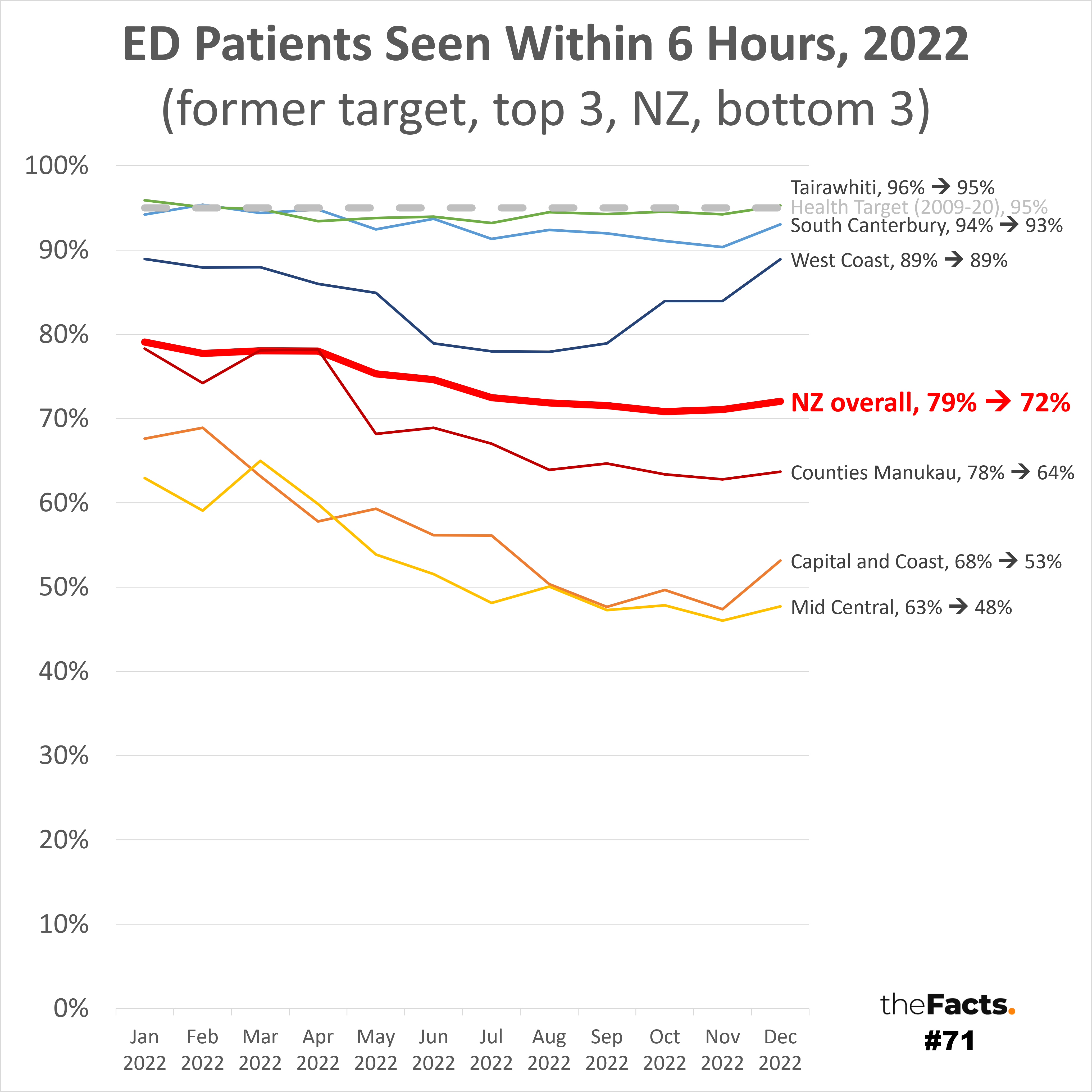
- Emergency wait times have got worse in all 24 DHBs from January 2022 to December 2022 except for:
- Waikato which improved 0.2 percentage points from 69.8% to 70.0%.
- West Coast stayed the same at 88.9%, although struggled from June to September, with scores dipping into the 70s.
- The top three performing DHBs for the most recent December 2022 data were:
- Tairawhiti (Gisborne region) = 95.3% (the only DHB to exceed the old 95% target)
- South Canterbury = 93.0%
- West Coast = 88.9%
- The bottom three performing DHB’s were:
- Mid Central (Horowhenua district, Manawatu district, Palmerston North city, Tararua district, The Otaki ward of the Kapiti coast district) = 47.7%
- Capital and Coast (Wellington City, Porirua City, Kapiti Coast) = 53.1%
- Counties Manukau = 63.7%
- The biggest decrease in performance was for Whanganui, which dropped 16.2 percentage points from 82.8% to 66.6%
- Other DHB results can be found using the SOURCE data link below or by contacting us.
KEY QUESTIONS
- Is the 95% target still used? Is it still the best guide of good performance?
- Is 6 hours the appropriate timeframe to measure? Should it be longer or shorter?
- Where is the data from 2009 to 2021?
- Why have ED wait times worsened so quickly?
- How do we rapidly improve ED wait times to a satisfactory or good level?
…
Have your say
…
Full data analysis
Please contact us if you would like the full analysis.
…
Other notes:
- All available data has been published. We will seek to get the data from 2009 to 2021, and also January 2023.
- Because only 12 months of 2022 was shared, we have had to compare December 2023 to January 2023. A fairer comparison would be to compare vs December 2022 to avoid any seasonality differences.
- A graph showing all 24 DHBs looked very messy, so we decided to show just the top 3 and bottom 3 DHBs. There was a very clear distinction for the top two and the bottom two with only two scores in the 90s and two scores ~50%.
- We changed the terminology of the “National” score to “NZ overall” to avoid any confusion with the National Party.
- All numbers are provisional and subject to revision.
Thank you to the Factors who helped pull this together.
…
SOURCE:
- 2022 ED wait times = https://www.tewhatuora.govt.nz/publications/national-performance-reporting-metrics/
Data published by Te Whatu Ora / Health New Zealand
(c) Crown Copyright
Licensed for use under the creative commons attribution licence (BY) 4.0
…
Did we make a mistake, or have you got smarter data? Let us know.


